This site uses cookies. If you continue to browse the site, we shall assume that you accept the use of cookies.

The bingo21's blog

1...678910...19
Posts 110 posts

Bingo's Top 10: Survivor Logos Nov 18, 2013
image
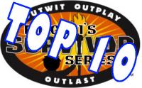
Well its been a while but here we have another blog in my series of top 10 blogs. Here I'm going to look at what I believe to be the top 10 logos used in my survivor series. I take pride in making all my logos but some are definitely better than others. I like to think my logos have gradually improved over time but sometimes the success of a logo is more dependent on the season's theme or location, rather than my own skill. So with that being said let's get to the list, hope you enjoy!

10th: Survivor Chile - Survival of the Fittest
http://oi43.tinypic.com/2v98yvr.jpg
This is just one of those logos that captures both the theme and location of the season. It's fairly simple not too complex, symmetrical and just sneaks into the top 10.

9th: Survivor Mesopotamia - Loved Ones
http://oi41.tinypic.com/20sa7ub.jpg
While this is probably one of the least eventful season of survivor that was plagued with self votes, I feel it holds it own up against the newer logos. It's the first of my logos to feature tengaged avatars on the logo and similar to the Chile one it illustrates both the location and theme of the season. The couples in the game are clear to see and the colour scheme evokes a feeling of dry location.

8th: Survivor Angola
http://oi41.tinypic.com/2lnhc0n.jpg
A logo where I really like the art chosen and the colour scheme. It's one of my favourite logos for a basic all newbie season where all I had to work with was the African Angola theme. I really like the font used for Angola as well.

7th: Survivor Scotland - Arch-Rivals
http://oi42.tinypic.com/2itr7o3.jpg
While I feel this logo could use a lot of touching up, for an 8th season attempt, its remained a favourite of myself and many other tengagers. The scottish theme gave me a lot to work with from warriors, to tartan, to the loch ness monster. While the font is a little crummy and the arch rivals text added in later, overall I think its a fun logo with lots of character.

6th: Survivor Haiti
http://oi41.tinypic.com/ruoarr.jpg
This is another logo that despite being for an all newbie season, is a stand out amongst my collection. It was a lot of fun to work with the pirate theme and I feel this logo has the right balance of everything. A cool font, complementary colours that fit well together (even though buff wise this season probably had the most horrid combination: grey, brown and pink).

5th: Survivor Bhutan - Fans vs Favourites
http://oi39.tinypic.com/2946xs5.jpg
Although I can think of a few improvements I'd like to make to this logo, I think its another one where the colours gel really well together. The survivor torch is such an iconic image and I really love that long flame in the top half of the image that's different to the torches featured on many other survivor logos. If I remade this logo I'd scrap the weasels on the side and either turn the pile of logs to a black silhouette or remove them completely. Maybe it's the Aussie reference of the green and gold that makes me like it so much but as far as logos with people in it this is one of my favourites.

4th: Survivor Rogues vs Righteous
http://oi39.tinypic.com/iciihg.jpg
While the cbs Heroes vs Villains doesn't really capture the whole good vs evil vibe, this logo does that. I love how the white text outwit, outplay, outlast stands out against the black background and I like the symbolism of the red and blue and how they intermingle in the middle of the logo. The skulls that flank survivor reinforce the battle of good vs evil while the location of greece and the idea of justice is present in the lower half of the logo.

3rd: Survivor Then vs Now
http://oi40.tinypic.com/xpriox.jpg
The logo of the current season makes it onto the list at number 3. While not referencing the location (Czech Republic), this season really captures the theme of then vs now. The faded colour of the outer ring and the survivor font emphasises the theme of time and this is further by the hour glasses on the left and right. There's sooo much going on in this logo but somehow it just seems to fit together. Lots of reference to past logos and themes and the black and white colour scheme doesn't detract from other parts of the logo. Although it looks poor in miniature, at its full size you can see a whole heap of elements that aren't visible in the smaller group image.

2nd: Survivor Tuamotus
http://oi42.tinypic.com/vwuxhl.jpg
Of all the non-themed seasons this is probably my favourite logo. It really captures the island location of Tuamotus focusing on coral reefs. This logo features one of my favourite borders and the myriad of colours on the logo ties into the tropical feel I was looking for. The white survivor text stands out well against the black middle and I also like how the central reef image on the top extends slightly beyond the borders of the semi-circle. The fishing net on the bottom ensures there isn't too much blue on the bottom half and it foregrounds the text and the starfish.

1st: Survivor Second Chances
http://oi44.tinypic.com/rbjhjp.jpg
People will probably disagree with this placement but I think this is a fun logo worthy of its number 1 spot. While Then vs Now focuses on the theme and not the location, arguably this logo does the opposite, focusing on the location and not the theme. Like scotland, Egypt is a really cool location to work with and my first season set there (Guys vs Girls) I didn't utilise the location in the logo so this gave me a chance to do that. Hieroglyphics are amazing so how could I not use them in the border. I made an effort to ensure that colours link up throughout the logo (the blue from the birds wings is used in the survivor text while the green from the flowers is used as the background in the middle section). The white outline around the images makes them stand out and the font for Second Chances is an interesting one. While fairly simple it's definitely one of my favourite logos I've designed.

Do you agree with the placings? Is there other logos you would have included?
If you'd like to be trended/tagged in these top 10 posts so you can follow them let me know. If you'd like to write up a top 10 for my series let me know as well. #survivor #Bingostop10

smiley20
MMAjunkieX
49288
remorawr
Boots22
spinner554
jakehou97
Gaiaphage
Joeker
Mearl
AshlynArehart
joshg222
01Gohan
sarge455
Piddu
thedarkpassanger
Timster
Cole91
Points: 49 11 comments
Survivor Then vs Now Recap 3 Nov 2, 2013
Would any of you guys like to talk about episode 3 of survivor then vs now in the viewers lounge. I'm free and online now if any of you are available to. Reply to this blog if you can. First to reply will probably be chosen.
Joeker
PeaceOut14
JETTEJ
Booyahhayoob
manalord
Missalice3
wangifold
SurvivorFan37
jamesthepezboy
Kpnna
thewinner
Points: 15 5 comments
Immunity Challenge #4 Oct 31, 2013
Hey guys since tengaged mail isn't working I've decided to tag you all here so hopefully you see the 4th challenge. Try to get in contact with your tribe-mates to let them know about the challenge because this one is truly based on a group effort.
http://www.tengaged.com/group/3082/forum/topic/10917389/last
Aesop
ShadowBaller000
Caliboy
Matthew929
Sarge455
Amf7410
Spinner554
Sergeant
Piddu
01Gohan
Cabutts23
Ferdinandz
Leli14
Porschefan101
Dfalc7
DragonJason
Mattkwon1
Points: 95 6 comments
Dodrio Challenge Oct 18, 2013
2mins to get 4 different colour levels to post.
Points: 8 3 comments
Immunity Challenge #5 Oct 5, 2013
For todays challenge you will attempt to get the most people to post your tribe name here. Players can only post for one tribe and if they post multiple times then I will only count their first post. People in the game can post once as well. After 12 hours the tribe that is mentioned the most will win immunity.

Survivors Ready GO!

Current Count as of aiwfwyattroh

#Arutua (7)

#Makemo (20)
Points: 105 28 comments
Immunity Challenge #9 Sep 8, 2013
Everybody starts with 10 points. The goal is to get as close to 20 points without going over at the end of the time limit (24 hours 8:04pm EST). To get a point a person who is not part of the game (includes current and eliminated contestants) must mention your name (incorrect mentions will still count as long as they are intelligible). Each person may only post once, if somebody posts more than once or for two people their first post will be the only one that counts. If they post a -1 next to your name IN THE SAME POST then it will take 1 point away from your score. You can not go below zero at any point. You don't need to post +1, but an absence of any +1 or -1 (or something stupid like -2) will count as a plus 1. Once people have posted they may not correct a plus or a minus but they may tidy up their mention by tagging properly etc. I will delete any posts that i wont be counting. In the event that people tie in terms of closest to 20 without going over, the player that reached their final score earliest will win! The 5 players who are closest to 20 without going over will win immunity. Thanks to Mearl for the challenge idea, it's one of my favourites :)

Marble (11)
DeniseNelson (10)
wangifold (10)
jamesthepezboy (13)
jojo7784 (7)
Matt99 (10)
Cole91 (13)
JosephinaAlexis (28)
KidA (13)
SimvivoRWay (13)

Current as of Booyahhayoob
Points: 112 45 comments
1...678910...19