COLORS CHALLENGE COMMENTS:
First of all, who did gave some of you to reserve color for this challenge? If you picked a color, then you should have posted immediately a photo right after. It's unfair for those models who had already a photo in hand but couldn't post just because their chosen color was reserved. Keep your "attitude" in check.
BELLA HADID (Brown) - There's no redeeming quality in your shot. You weren't able to give life to the "dull color brown". The face looks dead, the outfit looks cheap, and you standing there doesn't make the shot worthy of a second glance.
COCO ROCHA (Pink) - I LOVE IT! You really look so sweet and angelic in the photo. The "awkward" poses always work for you and it shows in this one. Your face looks divine and I love the pink outfit. That plus your hair style give this shot a sweet and teeny vibe. You're starting to grow on me after your not-so-impressive performance during the first week. Thank you!
EFREN PERDOMO (Dark Green) - I like it. You took a different route by applying your chosen color to your personality and it translated in the shot. You look relaxed and very natural. Your facial expression and outfit look very homey. The pose is simple but it works for your concept and you made dark green easy on the eyes.
JHONATTAN BURJACK (Light Green) - You tried but to no avail. I know you know the truth that the blue color stands out and the light green balls doesn't make the jacket pop in this shot. Your pose and facial expression are solid and you are really selling the outfit. It's just that the light green color doesn't serve its purpose in the shot.
JON KARTAJARENA (Black) - I definitely agree you do overthink at times and it shows again in this photo. This is not an over-the-top pose as it is way too simple. What caught my attention is the yellow part in the background, not your black suit.
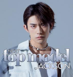
LAITH ASHLEY (Orange) - Everything you've said in your explanation doesn't resonate in the shot. It looks dull and I can't feel and see the joy and happiness vibe through it. The outfit looks very unflattering and your pose is very weak. I don't see the positive energy on your face. This photo feels flat and doesn't nail the theme.
LIZZO JEFFERSON (Purple) - The quality of your photos is really improving. It's a good shot but I don't see anything in your description that translated in the photo. The purple gown is wearing you and the text is really distracting.
LUKA SABBAT (Blue) - The shot could be anything but relaxing and refreshing. There's too much going on in the photo that I dunno what's the focal subject. Your facial expression looks tired and your pose is almost as the same as your pose in the last photo shoot - slouchy in a bad way. You should start thinking outside the box.
MILES McMILLAN (White) - I like how you incorporated the color white in this shot. The solid pose highlights your white suit and it blends well with the white background. As much as I like your facial expression, I don't think it resonates with pure and innocence. Plus the text is very distracting.
NYAKIM GATWECH (Red) - You look good in a red gown and your pose highlighted it in a very astonishing way. The problem is that I don't see the bravery you are talking about. Bravery is different from confidence and that's what I'm seeing in here - a confident woman, not a brave lady.
----------
KYLIE JENNER (Yellow) - I'm disappointed with you. I saw you online before the challenge came to an end and reminded you about the color left for you to work on. But you didn't submit. This would have worked:
https://imgur.com/a/ay23PO5 but you chose to ignore my message.