Shawn: An interesting interpretation of the theme but it makes sense, i do love this shot a lot, your expression and posing all fit great together and your really selling it, i really cant fault it
Miles: Your ecpressions weak and your pose is bland, coulda been improved by cropping to
Hao: this is a prime example of a photo that could be improved by cropping a bit, i imagine there was originally text or something supposed to go there, making the space to the left of the head only 2x the space to the right really balances it and makes a good albeit simple photo into a great photo(simplicity still there), tldr; coulda benefited a lot from using the rule of thirds
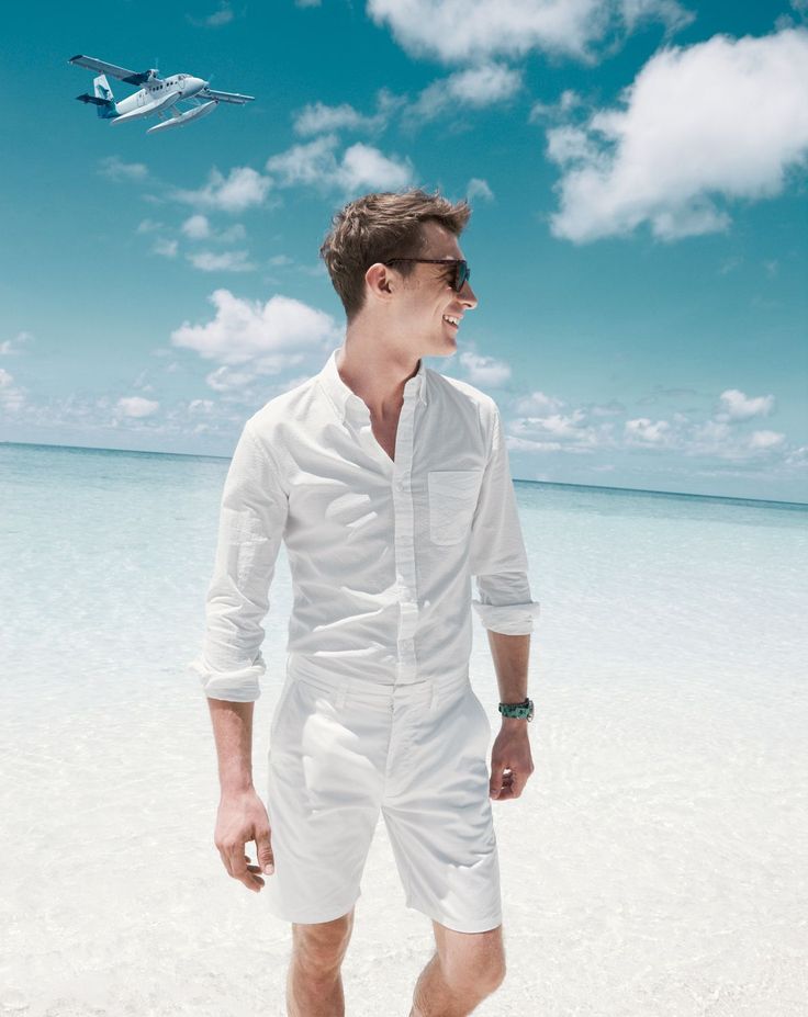
Devon: you really stretched the theme to thin and the photo is heavily over-edited
Yaya: Appearing twice in the same photo is generally not a great idea, your expression is basic and so is your posing, it feels like something you phoned in
Izi: as i said in your tryout you look bored, you need to step up as this while fine is incredibly basic and will eventually get you eliminated
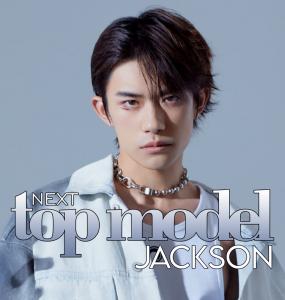
Matthew: please dont put the photoshoot 1st, i almost judged the extremely awful summer photo, meanwhile this one is relatively inoffensive but your also not really giving anything
Victoria: you cant talk about the theme and expect that to be enough, the photo is supposed to show it, its also quite an awkward looking an unimmpressive shot taken by itself
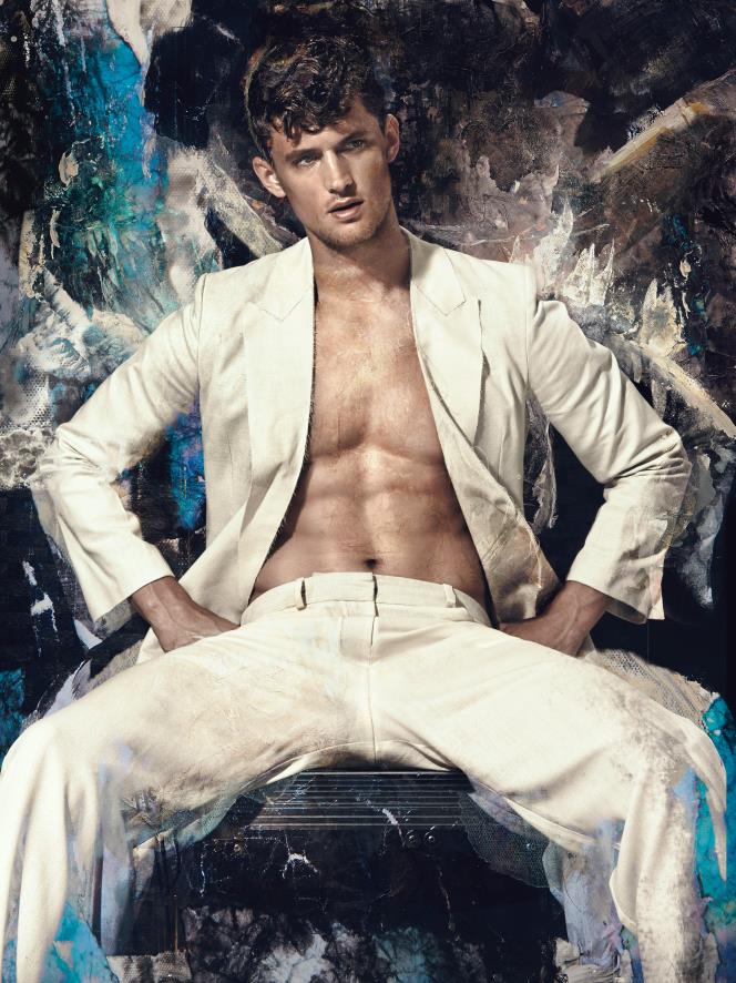
Lenox: another great example much like haos you could really improve it with a bit of a crop and applying the rule of thirds(instead of the body use the throne for the line here), could turn this good picture into a really great one
Clement: You really need to be a more engaging part in the photo, you look like any old schmuck reading a newspaper and not a model, theres nothing to draw the eye to you especially when your face draws ther eye to where your looking, the true star of the photo... the newspaper
Doutzen: I love how you went about the theme but your photo.. left some things to be desired, chief among them your blank expression and the way the hairr covers your face
Garret: Theres a lot to unpack here, first of all your pose is terrible and your expression doesnt do much to help, your also swallowed by the background and theres some bad editing around your legs
Coco: another great example of something that can be improved by cropping, the leg should be in the bottom 3rd and the empty space should be cropped out, coulda turned this good photo(really like your expression) into a great one
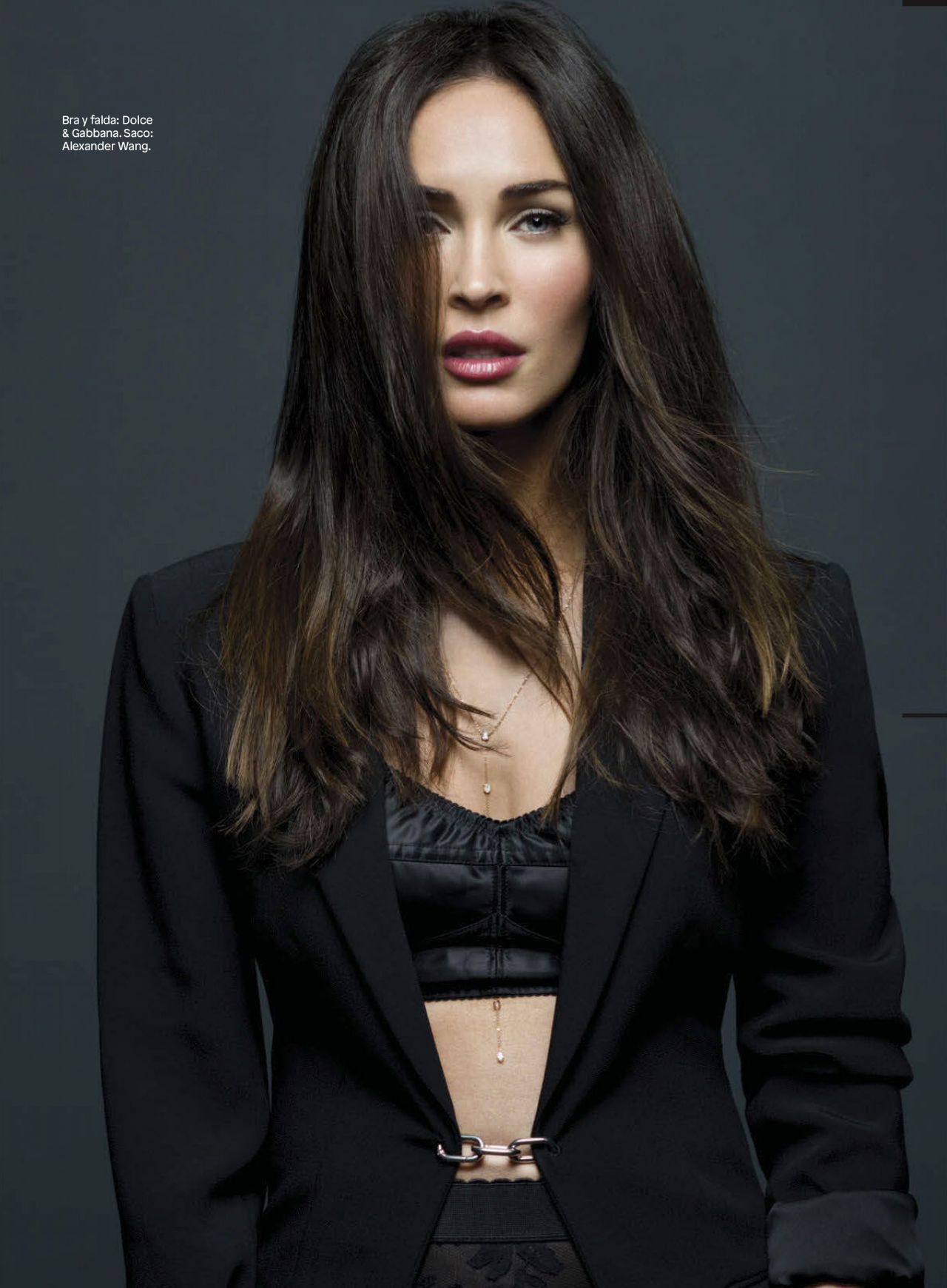
Megan: This is both criminally basic and has nothing to do with the theme, you bring nothing "fierce" or remotely special here
Dinara: I love this, your expression and posing are killer, my biggest complaint is that coat kinda swallows you up