CHALLENGE CRITIQUES ~
SEONGWOO ~ I love this photo! This photo screams pastel, and everything in the picture is pinpointed on nailing the concept of this challenge. I am getting a softer and cuter side to you, and it's amazing. The styling in this shoot is dead on. The hand over the eye is awkward, but everything else works in this photo!
JOURDAN ~ There is something that really draws me in with this photo. It is almost like the clothes are dripping off your body; it's an illusion that I think its very creative. As far as the color, I think that the yellow is too bright and overpowering to be necessarily pastel.
KIT ~ I am loving this photo. My favorite aspect about you is your eyes because you can really portray a story with your eyes. Your eyes really draw me in this photo. I love how the pastel background contrasts with your shirt. Overall, this is a great shot.
AUGUSTA ~ This photo definitely works in terms of the neutral/pastel grey tones. I love the soft and different vibe your facial expression is giving me. Something about your body positioning throws the photo off for me, also I feel like black & white pictures seem to be your go too. Somehow when I find myself clicking your links, I predict that the photo is black and white. I would suggest going out of the box because your photos are amazing, I just want to see something different.
ARTHUR ~ The styling of this shot is on point. I love the color scheme and the pastel blues. Something about this photo, however, it very mundane and ordinary. This photo does not scream "model" as much as I would've liked it too.
ROMEE ~ I feel like this photo could've been a lot better, knowing your capability as a model. You look beautiful, and the wind blowing in the picture is great, but there really isn't much else to this shot; it is an O.K. shot for me. Plus, I don't really see the pastel colors at all.
HARRY ~ The colors in this shot are really soothing and definitely pastel, but I wish there was more to this shot. Yet again, I feel like there is nothing much going on. You're kind of just standing there waiting for the photograph to get done taking the photograph. Definitely could've been stronger.
ADRIEN~ It is kind of hard for me to ignore the orange when the bright color kind of takes over the shot, but I see what you're saying. Even then so when you look at your shirt, it isn't really a pastel yellow. Same critique as Jourdan, definitely a strong shot but without the pastel colors.
JORDAN ~ I am actually in love with this shoot. I am getting diva, fierce, and bold. The makeup is a little much, but overall this is an amazing way to show off the emerald pastel color. However, I wish the pastel was more the forefront of the photo, as the jewels on the top kind of take over.
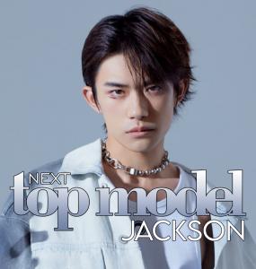
DON ~ This is a really strong shot. I love the pastel pinks in this color. It really takes a good model to pose in such a soft pink and still maintain their masculinity. Overall, I think this is a good, yet simple and subtle shoot. The arms are a little bit stiff for me though.
TYRA ~ I see where you were going with the "pumpkin" or "carrot" pastel inspiration, however this kind of falls short. The black background is definitely overpowering the shot for me. You are kind of just standing there looking pretty, which I feel like a continuing trend with your photos. I want to see something that is like a "wow moment' like your beauty shot in my opinion.
DUCKIE ~ no submission.
We will now wait for Jerard to reveal the winner I have chosen. I based my decision off the model who really captured and understood the essence of pastel colors and how to effectively make those colors the forefront of the shot. I think there were definitely some strong contenders, but one winner that really did that. Goodluck!