This site uses cookies. If you continue to browse the site, we shall assume that you accept the use of cookies.
Big Brother and online Hunger games.

#Stage8Teen - Homepage Rough Draft!

12thOct 1, 2017 by RaverKid
image
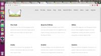
Woooooo!!! Apparently the drama surrounding Allison and Levonini has masked the fact that the rough draft was ready a couple of days late. But here it is! This is going to be the homepage of stage8teen.com, it's a rough draft. The layout is going to stay the same, but some of the coloration and the NavBar needs to be tweaked a little bit, my developer is working on that as we speak.

What do you guys think? Let me know in the comments, and if you have any questions, comments, or concerns, you can send them to my skype at jj.mcbride2 or you can send them to VegasBoy94 's mails. Thank you!

EDIT: Just realized you can barely see this. Let me know if you'd like a higher resolution copy, and I'll send it to you via skype.
EDIT EDIT: Credit for Kandee_ for being a boss bitch and uploading it for me on imgur bc I'm 128941289 years old and don't know how to do that.
https://imgur.com/a/6pkFi

Comments

Looks good with a magnifying glass. Send me a pic on skype: joshspektr
Sent by Josh742,Oct 1, 2017
omg text me this
Sent by Timberlie,Oct 1, 2017
:))))
Sent by VegasBoy94,Oct 1, 2017
isnt this like a template? lol
Sent by mathboy9,Oct 1, 2017
a few grammar issues and if i was doing it myself, i wouldn't have two different pages for logging in and registering.

the format seems like a carbon copy of tengaged's with different names for everything; the design isn't necessarily bad, it's just so similar to this website (and zwooper's for that matter as well)

i'd play around with the color scheme as white and grey isn't the most attractive color for a website, and maybe try different design schemes. make sure to take into account factors for different screen sizes (tengaged and many other websites don't always do this right either)
Sent by Milkisgood,Oct 1, 2017

Leave a comment